Tools
Figma
My Role
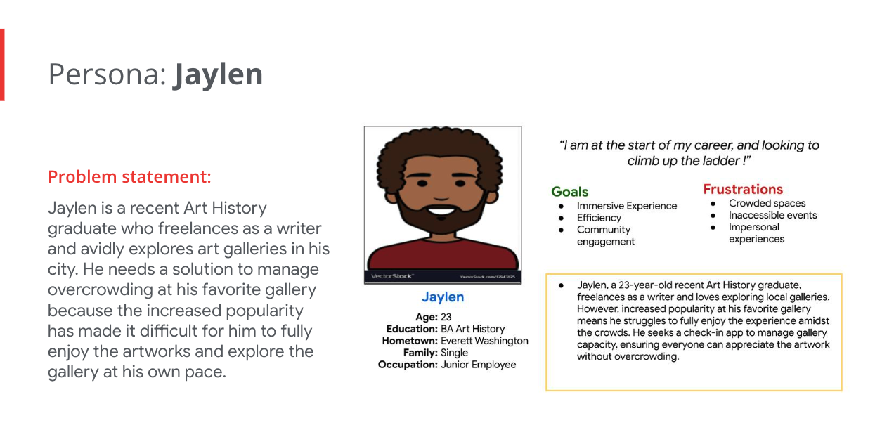
I conducted thorough user research on existing check-in apps to inform my design process.
Crafting innovative solutions, I oversaw the creation of a user-friendly check-in app tailored to Arte Noir's needs.
Through iterative design and user testing, I ensured an effective solution that addresses overcrowding while enhancing
the overall visitor experience. Guiding the project from start to finish, I facilitated collaboration across teams to
create a seamless and inclusive environment for art enthusiasts to explore the gallery's collections.
Objectives
- Conduct comprehensive user research on existing check-in apps.
- Design an innovative and user-friendly check-in app for Arte Noir.
- Iterate on design to refine functionality and usability.
- Perform user testing to gather feedback and improve performance.
- Ensure the app effectively addresses overcrowding while enhancing visitor experience.
The Design Process
Throughout the development of the Arte Noir project, my focus was on crafting an intuitive and seamless user
experience. Beginning with thorough user research, I delved into the preferences and needs of Arte Noir's diverse
audience. With a clear understanding of these insights, I established objectives that aligned with the gallery's
mission and vision. Employing a user-centered approach, I designed interfaces that were not only aesthetically
pleasing but also highly accessible to visitors from all backgrounds.
Each design decision prioritized functionality
and simplicity, honed through iterative testing and feedback loops. The culmination of this process resulted in a
check-in app that effectively addresses Arte Noir's challenge of overcrowding while significantly enhancing the
overall visitor experience, creating a more inclusive and enjoyable environment for art enthusiasts worldwide.
Pain Points
Long Queues
Visitors often faced frustration due to long queues during peak hours, resulting in a poor initial
experience and potential delays in exploring the gallery.
Inefficient Crowd Management
Without real-time monitoring tools, gallery staff found it challenging to manage crowd flow effectively,
leading to congestion in certain areas and potentially impacting the overall visitor experience.
Limited Data Insights
The gallery struggled to gather comprehensive visitor data, limiting their ability to understand visitor
demographics and preferences for future exhibitions and marketing strategies. .
Complicated Registration
The manual registration process was cumbersome and time-consuming, deterring some visitors from completing the
check-in process efficiently.
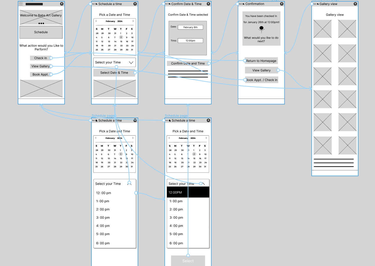
Paper Wireframes
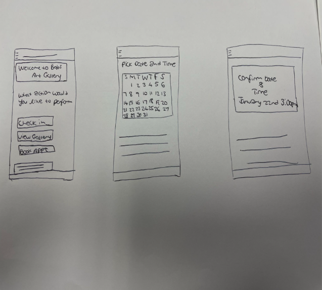
The goal of creating paper wireframes was to outline the basic structure and functionality
of the check-in app for the art gallery in a simple format. This process helped visualize key features and
interactions, such as registration and navigation, to ensure intuitive usability and task efficiency.
he thought process involved conceptualizing interface elements and their placement for rapid iteration and
feedback gathering.
Digital Wireframes
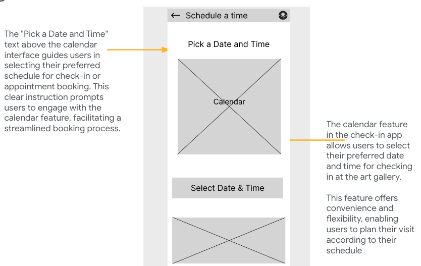
My goal was to visually represent the user interface, including the calendar feature and the "Pick a Date and Time" text.
This wireframe aimed to streamline the booking process, providing users with a clear and intuitive interface to select
their preferred date and time for check-in or appointment booking.
The thought process involved designing a layout that prioritized user clarity and ease of navigation,
ensuring users could effortlessly interact with the calendar to schedule their visit.
Low Fidelity Prototypes
View Designs
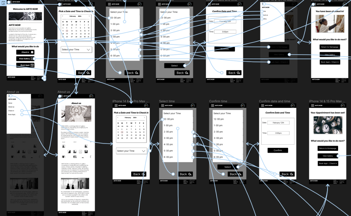
Listed above is the link to a simple user flow of my check in app. It allows for users to check in,
book appointments, as well as view the gallery
User Testing
In conducting usability studies for my check-in app, the focus was on gathering insights into user interactions and
feedback to enhance the overall user experience. Participants were guided through various tasks, such as navigating the app,
selecting dates and times, and completing the check-in process.
Round 1 findings
- Easy Navigation: Most users had an easy time navigating through the app
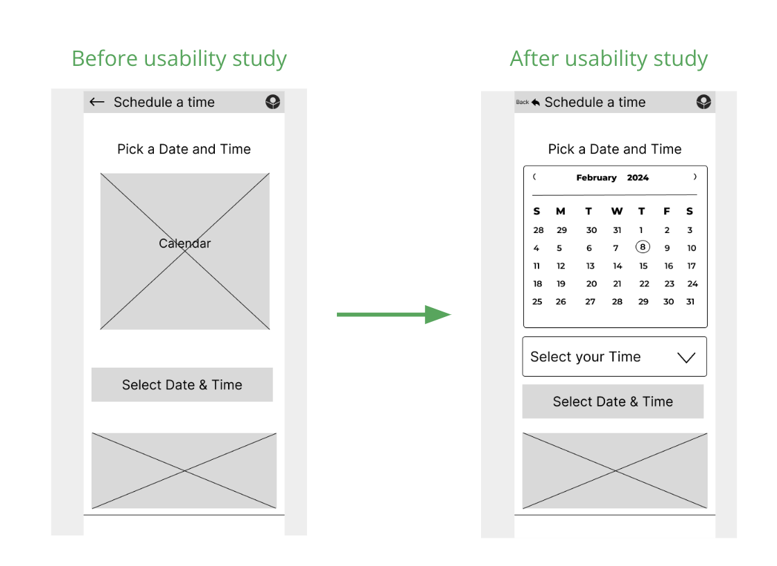
- Calendar Confused most participants: Most participants were confused by the non functioning calendar
in the low fidelity prototype.
- Lack of back arrows / buttons was confusing: Most users had problems navigating back to the homepage due
to the lack of a back button / arrow
Round 2 findings
- Calendar Implementation was great: Most users said that the implementation of a functioning calendar improved
their user experience and made it much easier.
- Back arrow Implementation helped Navigation: Most users admitted that the inclusion of back arrows / buttons helped
made the overall navigation process easier.
- Overall User experience improved: Most participants were satisfied with the changes made and admitted that it
enhanced the user experience for them
Mockups
After a usability study, it was clear that many participants were confused by a non-functioning calendar.
In response, subsequent mockups included a fully operational calendar to enhance user experience and address
usability issues identified during the study.
High fidelity prototypes
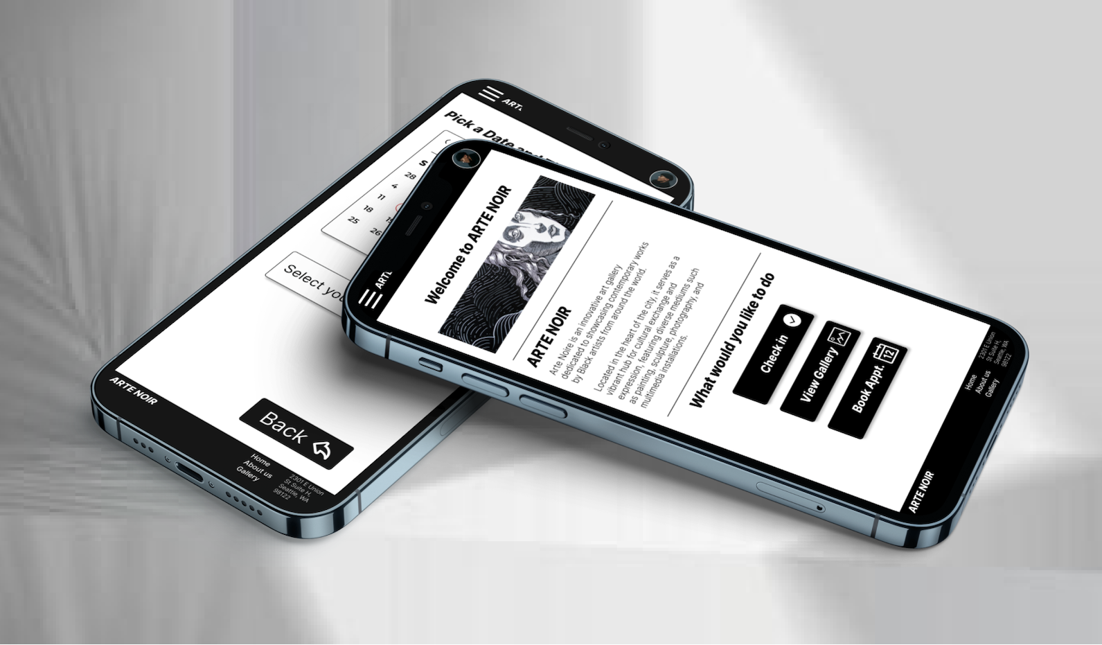
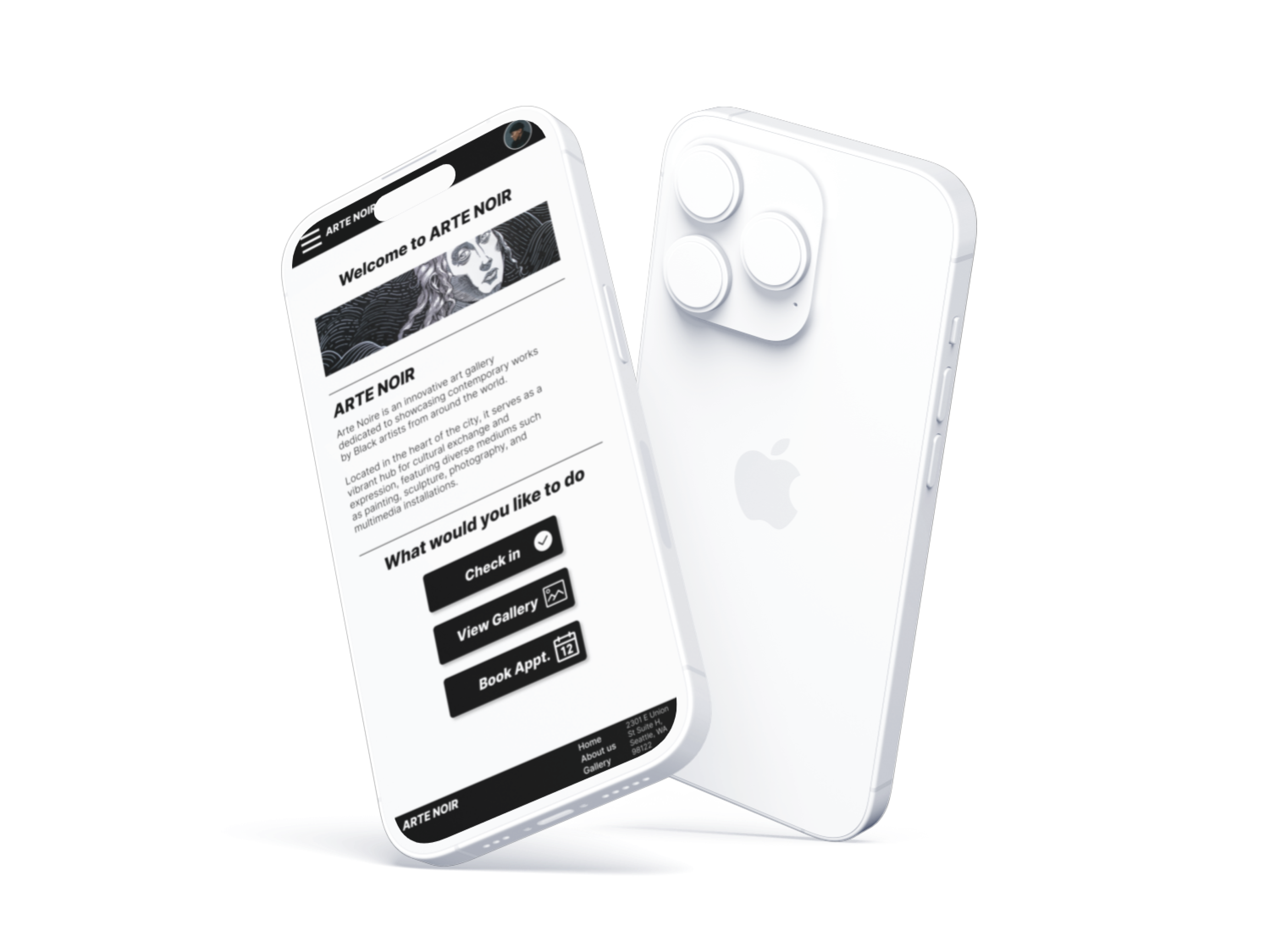
The link to the high-fidelity prototypes for the check-in app to the art gallery offers users a preview of the
finalized design and functionality. These prototypes allow users to interact with key features like check-in,
appointment booking, and gallery exploration, providing valuable feedback for refinement before the official launch.
Figma Embed Example
Conclusion
Designing the Arte Noir Check-in app as a personal project was not only a valuable learning experience but also an
immensely rewarding one. Leading the entire design process independently allowed me to gather insights from usability
studies, prioritize features based on user feedback, and integrate intuitive functionalities like calendar-based scheduling.
This streamlined the check-in process and ensured a positive experience for all users. Additionally, implementing
high-fidelity prototypes and accessibility considerations further enhanced inclusivity, making it a fulfilling endeavor
overall.
Takeaways
With this being my first large scale Personal project, here are some of the things I plan to improve on going forward
- Continuously seek and incorporate user feedback to refine designs and address evolving user needs effectively.
- Explore and implement advanced usability testing methodologies to gain deeper insights into user behaviors and preferences.
- Enhance collaboration skills by seeking input from diverse stakeholders and integrating different perspectives into
the design process.
- Strive for even greater inclusivity by further prioritizing accessibility considerations and ensuring that all users can engage
with digital experiences seamlessly.
Thank you for Reading✌︎
